 |  |
| |
![]() Allstate Card Solutions is an industry leader in designing and manufacturing customized scratch off cards
Allstate Card Solutions is an industry leader in designing and manufacturing customized scratch off cards
![]() Our Gift cards are durable, strategic designed and competitively priced to fit your marketing budget.
Our Gift cards are durable, strategic designed and competitively priced to fit your marketing budget.
![]() POSA (Point Of Sale Activation card) The card has no value and is useless in it's inactivated form.
POSA (Point Of Sale Activation card) The card has no value and is useless in it's inactivated form.
![]() Issuers around the world trust Allstate Printing to create highly successful SIM card programs.
Issuers around the world trust Allstate Printing to create highly successful SIM card programs.
![]() They allow guests to gain access to their rooms and/or specific areas of the hotel printed on plastic.
They allow guests to gain access to their rooms and/or specific areas of the hotel printed on plastic.
![]() Effective customer loyalty and membership card programs convert first-time visitors into full-time advocates.
Effective customer loyalty and membership card programs convert first-time visitors into full-time advocates.
![]() Print cards for your Music or Game product. We can help from the project concept to final production.
Print cards for your Music or Game product. We can help from the project concept to final production.
![]() We can help producing your pharmacy prescription card; We will design/print/personalize your card.
We can help producing your pharmacy prescription card; We will design/print/personalize your card.
|
|

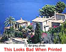
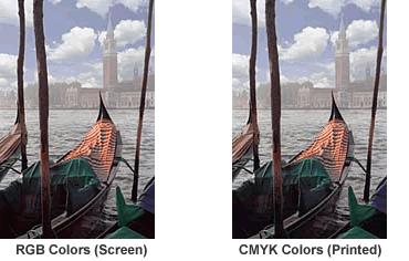
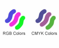
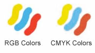 There are some small differences. Scanners and digital cameras create images using combinations of just three colors: Red, Green and Blue (called "RGB"). These are the colors that computers use to display images on your screen. But printing presses print full color pictures using a different set of colors: Cyan (blue), Magenta (red), Yellow and Black (called "CMYK"). So at some stage your RGB file must be translated to CMYK in order to print it on a printing press. This is easily done using an image editing program like PhotoShop, PhotoDeluxe, or Corel PhotoPaint.
 You will have more control over the appearance of your printed piece if you convert all of the images from RGB to CMYK before sending them to us. When we receive RGB images, we do a standard-value conversion to CMYK, which may not be perfectly to your liking. We want you to be happy, so please, take the time to prepare your file properly. We cannot be responsible for sub-par results if you furnish low-res images or RGB images.
Be aware that it is possible to make colors in RGB that you can't make with CMYK. They are said to be "out of the CMYK color gamut". What happens is that the translator just gets as close as possible to the appearance of the original and that's as good as it can be. It's something that everyone in the industry puts up with. So it's best to select any colors you use for fonts or other design elements in your layout using CMYK definitions instead of RGB.
You will have more control over the appearance of your printed piece if you convert all of the images from RGB to CMYK before sending them to us. When we receive RGB images, we do a standard-value conversion to CMYK, which may not be perfectly to your liking. We want you to be happy, so please, take the time to prepare your file properly. We cannot be responsible for sub-par results if you furnish low-res images or RGB images.
Be aware that it is possible to make colors in RGB that you can't make with CMYK. They are said to be "out of the CMYK color gamut". What happens is that the translator just gets as close as possible to the appearance of the original and that's as good as it can be. It's something that everyone in the industry puts up with. So it's best to select any colors you use for fonts or other design elements in your layout using CMYK definitions instead of RGB.